March 14, 2015

#GM2015: Gaphika Day 2

It's February already and it also marks the 2nd day of Ten Years of Graphika Manila. If you haven't read Day 1 of #GM2015, click here. As usual, i was super early and so pumped up to sit and listen for the lineup of speakers. Here's one of many shots of Tennyl and I while waiting in line for 3 hours!


The conference kicked off with Pinoy graphic artist and DesignByHumans superstar, AJ Dimarucot. AJ is known for winning tons of t-shirt design contest in the popular website and also worked for popular brands like Nike, Adidas and Zoo York. He also ventured in business with his wife and created a clothing line for kids, googoo&gaga. He started his career way back when you have to "drop shadow" manually.


AJ also mentioned how people all over the world understand, appreciates and even loves his works. Design is a universal language indeed!

The next speaker was the one that we've all been waiting for. All the way from California, Walt Disney Animation sent one of their animators, Benson Shum, to show us some behind the scenes of their Oscar-winning feature films like Big Hero 6 and Frozen.

During the pre-production of Big Hero 6, they had an activity on animating an egg shaped object in 3d. Each shape represent a character and the challenge is to animate the assigned character as if its walking. When the eggs were place side by side they all have different body language which is fundamental to the character's performance. Here are some cool things Benson showed us:


The last three films he worked on:


People in Disney Animation studios:


When they finish half of the film, they all have a big break and just play!

Disney's upcoming animated feature films: Zootopia and Moana:


Big Hero 6 is based on this comic book series of the same title:


What makes their animated films successful?
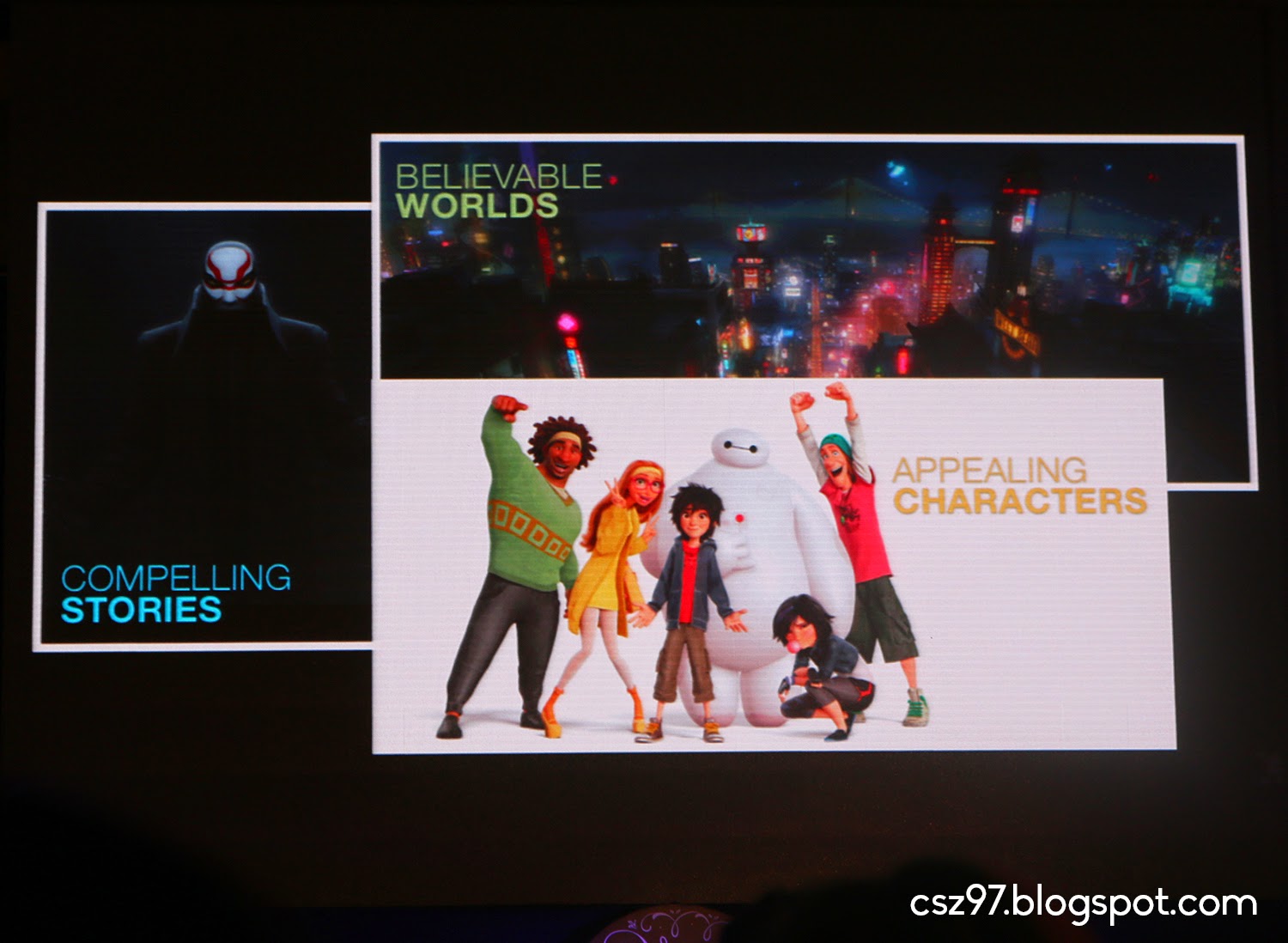

Even though they use 3d animation, the creative phase starts in pencil and paper. Here's the character sheet of Gogo Tomago.

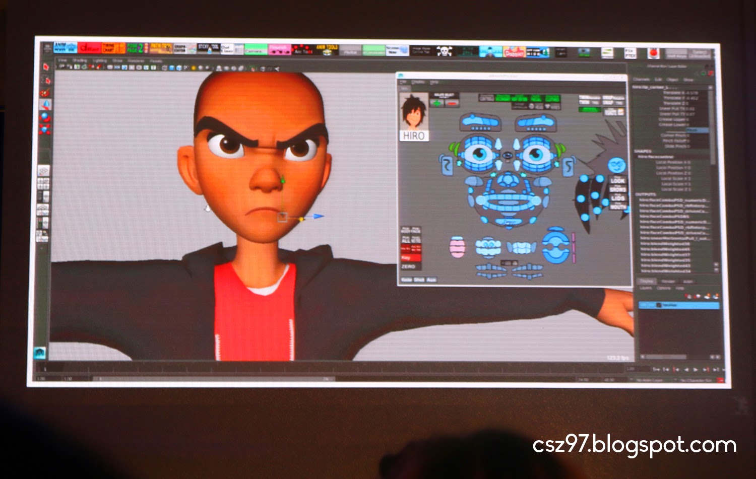
Disney uses Maya for animation. Here's a look of Hiro and how they animate his face.
All about Baymax!

Benson showed us the process of some of the scenes he animated like the part when Anna was a kid. In the scene, she was jumping around when she sees the snowflakes falling around her. To get the moves right, he filmed his nephew while playing and referenced the movements and little nuances from the clip.

Here's the entire staff and crew of Disney Animation Studios. Someday, i'll be there too! :) #TiwalaLang


Benson really inspired us to really pursue our craft but it will take a lot of experience and learnings to reach those big dream. Honestly, i'm far behind in terms of this big dream of mine but i'm still hoping someday I'll work in one of those huge studios creating films. After his talk, we had a lunch break. We ate at BonChon and rushed back as quickly as we could.


The afternoon session started with New York based duo Anton and Irene. They talked about Digital Design like their works for US Today and Wacom. They expressed how important structure is in not only in their work but in every aspect of life. As web designers its all about the structure to convey they message to the viewer more efficiently. They talked about pitching and how difficult it is.


There was one time when they pitched for two companies of the same line of interest and how others try to put them down. I had a lot of laughs about their Wacom project. Although they're not professional videographers, the client really wanted their sample video so they were asked to do the video for the website. Here they are using a trolley as an improvised dolly with the CEO of Wacom.hahahaha


Up next is local shirt designer Nick Automatic who started with almost nothing and now has a big shirt apparel business. He's undoubtedly the funnest of all the speakers!


A photo posted by Tennyl Dehm Canlas (@tennyldehm) on

He still uses Macromedia Flash 8 for his designs but his works are pretty dope!


The next speaker came all the way from España, Multimedia Designer, Enric Godes of VASAVA. He looks like Andy Cooper ;) Enric talked about their Typography works like the font of Team Barcelona in FIFA. The font resonated the culture and identity of the place and it became very famous there.


He also expressed that through copying, we learn. Since we were infants, all we do is copy our parent's words and thus we learn how to talk. In design and art, this is very true, too. On the journey of copying, learning and practicing, there will come a time that your own identity will be developed.


And last but not the least, is the wacky and funny Joshua Davis. He was the first ever international speaker of Graphika way back in 2006. He uses programming and algorithms to create his designs. It's really amazing how technology can create beautiful works but its nothing without the creativity of the one using it. Although most of his outputs are digitally generated, he also ventured in transforming them to tangible forms like murals and skateboards.


He was very funny and even poked fun at the other speakers. Anyways, after years of his success in digital design, he's always hungry for more. He was also fearful of being stuck in what he's comfortable doing and that's what most of us who already work for long are doing now. Personally, i can relate to him. I don't want to be content in one knowledge area and keep on repeating it. There's a point in time when we have to learn new things and expand our horizons. So don't let success get away with your creativity.


That's it! Graphika Manila was a blast! Their words will surely resonate to all the audience and for me, ill always keep their wisdom in my heart. These great people are my inspiration so that someday ill also fulfill my dreams. Here are the photo ops with the speakers during the meet and greet after the conference.

Clockwise from top left: Machineast duo Reza and Fiza; AJ Dimarucot; Anton and Irene and my idol Leeroy New.

Clockwise from topleft: Seb Lester; Enrico Godes of Vasava; Benson Shum of Disney Animation; and Nick Automatic.

Pomme Chan and Joshua Davis.

Congratulations to all the speakers and organizers for a successful 10 Years of Graphika Manila. Hoping for a bigger and better Graphika next year. Looking forward for GM2016! Thank you for reading!

March 08, 2015

#GM2015: Ten Years of Graphika Manila!

Yes, Graphika is now on its 10th year and it's bigger and better! My first Graphika was on 2007 held at the Centerstage Cinema of SM Mall of Asia. There were only about a couple of hundred of participants and it was so cool being with the people in the industry which as not that big at that time. I attended 5 out of 9 Graphikas before and this year I made sure that i won't miss the event. Because it's a milestone, they expanded the conference into two-days with double the number of speakers, too. Together with me were my college mates Tennyl, Jane, Joseph and Lej. My blog entry for this year came late because I had a lot of travels recently. I'll feature here photos from our instagram account and some anecdotes a.k.a. live tweets that day.

A photo posted by Ced Zabala (@cedzabala) on

Jan 31, 2015 - Day 1. I went 3 hours early as usual, and was one of the first few people in line outside SMX. The waiting paid off and we got great seats! There's nothing really new worth saying about the conference, but i applaud the organizers for the good control of the crowd. The conference kit was nice. When I got the GM Book, i was happy to see my artwork :) Tennyl and I bought the limited edition T-shirt with a free GM2013 Book. When we browsed the book, i was totally surprised to see again one of my artworks. I forgot that I submitted that year because i wasn't able to attend due to the change of schedule from August to February. These are the two artworks that got included in the GM Books.


Day 1 started with a throwback. The first presenter was also the speaker on the first Graphika that i attended. The Asylum, a Design studio based on Singapore, takes a multi-disciplinary creative approach by integrating branding and spatial design. Represented by Chris Lee, he showed great humor with their process and outputs and proved that being a designer is a lot of fun. Here's my favorite lines from his talk: Design is Global. Design is Multidisciplinary. Design is Collaborative. Design is Adaptive. With my 8 years of experience in design, i truly believe in that visuals are a universal language. It adapts with new technology and inspires and in return be inspired by different cultures and nations.


The second speaker came also from Singapore, Machineast. The team is an awesome duo of Reza and Fizah (Malaysian) who created this year's visual identity for Graphika. They showed us how they came up with the concept, like how they were inspired by their visit here in the Philippines last year and discovered Halo-Halo. Check out the creative process of their work in their Behance page. I love the contrast between the two which, when combined, has a lovely combination. Reza is into the black and gold metallic sharp and clean style while Fiza is more into the light pastel, girlish style. Both worlds collided with the Graphika Manila project and it inspired me to learn more 3D in the future.


They also expressed the importance of Collaboration and Sharing your work to others because you'll never know where it will lead you. I'm a testimony to that. I started with nothing and now I can't believe i'm working for the City Mayor's office. This pushes me to accept more opportunities so i can expand my network, and who knows what type of projects awaits me in the future.


After their talk, it was time for a lunch break. It has been my tradition to have my Graphika Lunch at Tokyo-Tokyo, so we ate there. After our quick break, we have to rush back so we can have good seats.

A photo posted by Tennyl Dehm Canlas (@tennyldehm) on

Kicking off the afternoon session is Pomme Chan, a Thai Graphic designer / Illustrator who studied and worked in London. Returning back Bangkok, she pursued illustrative works for big companies like Sony, MTV, Volkswagen, and Mercedes-Benz. I really love her hand-drawn, feminine style which reminded me of last year's speaker Hello Zso. Her style is organic and simply eye-candy. She ventured into package design and fashion too. She's a quirky girl and was a lot of fun.


During the question and answer portion, she was asked how to find your own art style. She said that style is overrated. Try drawing everyday and when you look back at the pages, you will discover your own style. I realized that whatever we draw, it's never the same with others because we have our own set of inspirations and ideas and the mere stokes of the pen or brush and colour choice will reflect our own artistic identity. You just have to practice and soon you'll develop your own style.


The next speaker said he was the odd one out of all the speakers coz he's not a designer. Leeroy New, an Installation artist, really stood out for me. I've been following his works since his early years and i just loved him! He's also a Mindanaoan like me, too! He shared his childhood stories like his fondness in weird alien-looking figures. Now, he's famous with his artworks featuring blobs, drips, spikes, and extra-terrestrial-inspired configurations.


His art tends to start with a small concept and he allows it to develop into a bigger form. He creates accessories with toys he bought in Divisoria, then it would evolve into head dresses, costumes, and furniture, performance art until it expands to architectural installations. He's loyal to his materials and he really shows great determination in his craft. He's a smart dude and I was really starstruck when i met him in person ^_^ Btw, he also did some costumes for Lady Gaga.


The next speaker is Sid Medrazo of 88 Storey films, a videography and Production studio who is famous for advertisements like the "Coke Beat" which was very popular during our high school days. Sid talked about the "Art of 30 seconds". He's got mad skills in his discipline f'sho. And the last speaker for Day 1 was London-based typographer and calligrapher, Seb Lester. His works includes the design of typefaces for Intel, British Airways and H&M. We're in awe when he showed his stacks of moleskins filled with doodles and calligraphy. His instagram account @seblester is famous for recreating famous logos and titles such as Harry Potter, Coca Cola, and Game of Thrones using pen and ink on paper. I love his dedication to letterforms and in my part, i would like to explore more with different letter styles and do it myself. I'll buy myself a fountain pen soon. During the meet and greet, he signed my name in script style which was awesome!

A video posted by Seb Lester (@seblester) on


And that wraps day 1 of Graphika Manila 2015! I had inspiration overload and the next day surely gave me more! You can post some comments below or read about my previous Graphika experience with the links after the comment box. Click here for Day 2!

Edit: Check out my buddy, Tennyl's video of our trip :)

Graphika Manila 2015 Experience Part 1 from TDC Prod House on Vimeo.