2011
conference
design
events
graphic design
graphika manila
review
travel
Graphika Manila 2011 Review
This is my third time to attend the biggest conference on design. I am usually one of the earliest in the venue but due to the rain, there were lots of people lining up already. The line was so confusing. Since i bought my ticket through bank deposit, I have to go to a separate line to get my ticket in exchange of a voucher that they provided. The students already had their tickets so it was so disappointing seeing them entering the hall while i was waiting for my ticket. I wished that they just sent the ticket to me before the conference like what they did before.
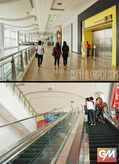
Unlike before, this year's conference was held at the SMX Convention Center which is wider (see photo below) and can accomodate more people. Before it was held at the cinema where you can see their works in the big screenes. But in SMX, the ceiling is low so there is no big screen. Instead, they provided 4 LED Screens. Since i entered late, i was seated almost at the back. I can hardly read the texts in the slides. I really prefer the cinema cause the presentations will look much more amazing in the big screen and the seats are more cozy than the chairs in SMX.

Well, that's it for the downside of my review. The rest went just fine. I really like the conference kit which included the better looking ID, better bounded GM Book, the program, some stickers and stuff. They didn't give a poster, though.
 Anyways, the most important thing in this conference is the lineup of Speakers. I must say they we're really amazing and inspiring. I was really entertained by all of them, some are too serious but their works are so impressive.
The first speaker is the duo of 27+20 (Twenty-seven Twenty). They shared some of their experiences and work flows like their toxic schedule in making a documentary for ANC in just a week; and the infographic about Mercedita Gutierrez. It was really entertaining. They also showed some of their works like the music video which incorporated both 3d animation in live action settings. They were fun and cool.
Next in line was Dan Matutina, a UP Fine Arts graduate, and an awesome illustrator. I've seen his works before and I am truly a big fan. My style is somewhat similar to his which is textured, vibrant, with the mixture of clean and dirty, and old and modern. His concepts are witty, humorous and cool. He shared his story by chapters, from his beginnings to his evolution of style. He even gave some tutorials on how to make his own textures. He's very funny and awesome.
Then it was lunch time :D I was with my former schoolmate, Micco, who was the heir of my throne as the Creative Director of our school publication, Beacon Newsmag. We had our lunch at Tokyo2x (It's a tradition of mine to have my lunch there during Graphika Manila). Then we headed back to SMX and looked for a better seat.
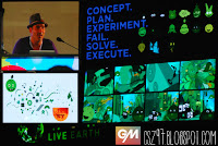
To start the afternoon, Seph Mayol, a Cebuano designer/developer showcased his web and interactive designs. His clients include Latino singers and Games for famous animated movies like the upcoming 3D film by Pixar, Cars 2. One of his unique works is his experimental interactive installation. He had a live demo of the app which creates an abstract motion graphic based on the image captured by the camera (see photo to the right). A lady danced in front of the camera and, simultaneously, we can see the abstract motion graphics forming the silhouette of the dancer. It was really impressive. It reminded me of this awesome installation where kids can grow trees and control the river flow of a virtual forest. I'm happy that there are projects like this here in the Philippines.
 Laundry! was up next. It is a design and animation studio based out of LA, California. They make motion graphics and animation for music videos, TVC's and more. I learned the three approaches in making a video. The backward, forward and freestyle approach. I realized that i have been doing these approaches before. The approach usually depends on the resources given. Their clients include Nicki Minaj, MTV, VH1, Nike, The Cool Kids and more. I was just in awe looking that those crazy graphics and animation in the music video.
 The next speaker is Mike Friolo aka Monkey Mike, the senior designer of Nike, Inc. in Oregon who designed and conceptualized Manny Pacquiao's gears, logo and crest. He showed the design process in creating the logo and crest from sketch, to studies, to revision, to criticisms, to final design, and everything in between. He also explained the influence, inspirations, and symbolism he used in coming up with the logo. You can say that he is really grounded to his Pinoy roots. Mike also designed the shoes of Pacquaio and is so lucky to have Nike make those designs a reality for him. I wish i can be a shoe designer someday :D
And finally, the one everybody is waiting for. The final speaker represents WETA Digital, the world leading visual effects company based in New Zealand. They won an Academy Award for Best Visual Effects on James Cameron's AVATAR. Some of their works include X-Men2, Matrix Revolutions and Beowulf. Kevin Smith, a Digital Effects supervisor, showed us how the animation pipeline, the different departments, and people who worked on the effects for Avatar. It took hundreds of people just to make a shot. He outlined the parts of the pipeline like Motion Capture, Modelling, Rigging, Animation, Lighting, Matte Painting, Special Effects, and more. Each department constitutes different sorts of artists, programmers, and technicians. In the company, they only hire experts on that field. Some are undergrads, but some have majors in Math and Physics.
Every part of the pipeline is essential for the efficiency of the flow of work. Hundreds of people collaborate just to create that revolutionary movie of the century. The movie was exceptional and it requires quality work from artists and people in the industry like those people in WETA Digital. Every participant was just amazed by what we learned and seen. I just wished that someday i will also be one of those people.

Well, Graphika Manila went well and it was really worth the pay. Though i didn't like the ticketing and venue, the most important thing is that i brought home inspiration that i got from the speakers. I just hope that they will take our feedback constructively and wish that next year will be a better one. Here are some of my shots during the conference :D
Unlike before, this year's conference was held at the SMX Convention Center which is wider (see photo below) and can accomodate more people. Before it was held at the cinema where you can see their works in the big screenes. But in SMX, the ceiling is low so there is no big screen. Instead, they provided 4 LED Screens. Since i entered late, i was seated almost at the back. I can hardly read the texts in the slides. I really prefer the cinema cause the presentations will look much more amazing in the big screen and the seats are more cozy than the chairs in SMX.

Well, that's it for the downside of my review. The rest went just fine. I really like the conference kit which included the better looking ID, better bounded GM Book, the program, some stickers and stuff. They didn't give a poster, though.
 Anyways, the most important thing in this conference is the lineup of Speakers. I must say they we're really amazing and inspiring. I was really entertained by all of them, some are too serious but their works are so impressive.
The first speaker is the duo of 27+20 (Twenty-seven Twenty). They shared some of their experiences and work flows like their toxic schedule in making a documentary for ANC in just a week; and the infographic about Mercedita Gutierrez. It was really entertaining. They also showed some of their works like the music video which incorporated both 3d animation in live action settings. They were fun and cool.
Next in line was Dan Matutina, a UP Fine Arts graduate, and an awesome illustrator. I've seen his works before and I am truly a big fan. My style is somewhat similar to his which is textured, vibrant, with the mixture of clean and dirty, and old and modern. His concepts are witty, humorous and cool. He shared his story by chapters, from his beginnings to his evolution of style. He even gave some tutorials on how to make his own textures. He's very funny and awesome.
Then it was lunch time :D I was with my former schoolmate, Micco, who was the heir of my throne as the Creative Director of our school publication, Beacon Newsmag. We had our lunch at Tokyo2x (It's a tradition of mine to have my lunch there during Graphika Manila). Then we headed back to SMX and looked for a better seat.
To start the afternoon, Seph Mayol, a Cebuano designer/developer showcased his web and interactive designs. His clients include Latino singers and Games for famous animated movies like the upcoming 3D film by Pixar, Cars 2. One of his unique works is his experimental interactive installation. He had a live demo of the app which creates an abstract motion graphic based on the image captured by the camera (see photo to the right). A lady danced in front of the camera and, simultaneously, we can see the abstract motion graphics forming the silhouette of the dancer. It was really impressive. It reminded me of this awesome installation where kids can grow trees and control the river flow of a virtual forest. I'm happy that there are projects like this here in the Philippines.
 Laundry! was up next. It is a design and animation studio based out of LA, California. They make motion graphics and animation for music videos, TVC's and more. I learned the three approaches in making a video. The backward, forward and freestyle approach. I realized that i have been doing these approaches before. The approach usually depends on the resources given. Their clients include Nicki Minaj, MTV, VH1, Nike, The Cool Kids and more. I was just in awe looking that those crazy graphics and animation in the music video.
 The next speaker is Mike Friolo aka Monkey Mike, the senior designer of Nike, Inc. in Oregon who designed and conceptualized Manny Pacquiao's gears, logo and crest. He showed the design process in creating the logo and crest from sketch, to studies, to revision, to criticisms, to final design, and everything in between. He also explained the influence, inspirations, and symbolism he used in coming up with the logo. You can say that he is really grounded to his Pinoy roots. Mike also designed the shoes of Pacquaio and is so lucky to have Nike make those designs a reality for him. I wish i can be a shoe designer someday :D
And finally, the one everybody is waiting for. The final speaker represents WETA Digital, the world leading visual effects company based in New Zealand. They won an Academy Award for Best Visual Effects on James Cameron's AVATAR. Some of their works include X-Men2, Matrix Revolutions and Beowulf. Kevin Smith, a Digital Effects supervisor, showed us how the animation pipeline, the different departments, and people who worked on the effects for Avatar. It took hundreds of people just to make a shot. He outlined the parts of the pipeline like Motion Capture, Modelling, Rigging, Animation, Lighting, Matte Painting, Special Effects, and more. Each department constitutes different sorts of artists, programmers, and technicians. In the company, they only hire experts on that field. Some are undergrads, but some have majors in Math and Physics.
Every part of the pipeline is essential for the efficiency of the flow of work. Hundreds of people collaborate just to create that revolutionary movie of the century. The movie was exceptional and it requires quality work from artists and people in the industry like those people in WETA Digital. Every participant was just amazed by what we learned and seen. I just wished that someday i will also be one of those people.

Well, Graphika Manila went well and it was really worth the pay. Though i didn't like the ticketing and venue, the most important thing is that i brought home inspiration that i got from the speakers. I just hope that they will take our feedback constructively and wish that next year will be a better one. Here are some of my shots during the conference :D


 Cedrick S. Zabala "CSZ97" is a multimedia artist based in the City of Zamboanga. He graduated with a Bachelor's degree in Information Technology major in Multimedia and Computer Animation. Currently he works at the City Government of Zamboanga under the Mayor's Office as a Public Information Officer, and as a part-time Instructor in Ateneo de Zamboanga University. He is currently taking his Master's Degree in Public Administration in Western Mindanao State University. He lives a life with a passion for the arts, culture, and travel. This blog contains his works and travel journals. Carpe effin' Diem!


Post a Comment