
branding
business
creative process
graphic design
logo
logo design
marketing
milk tea
proposals
studies
workflow
Logo Design: Tea.gre Milk Tea
 This is my latest branding project for an upcoming business in Manila. I was asked to do a logo for a new Milk Tea business offering authentic taiwanese milk tea. The name is "Tea.gre" and the idea is to put some tiger feel on it. I started with my research on the existing milk tea brands and here are some of them.
I observed that there are four main themes in milk tea logos. First, is the tea leaf, which of course, symbolize the tea element of the product. Second, is the informal/creative use of typography. Since its a food business, the fonts used are not too formal, very readable and fun to look at. Third, is the use of secondary vibrant colors. Aside from green as the common color representing tea, they used another vibrant color such as pink, purple or orange to add a pop of color into the logo.
Lastly, I noticed that they also incorporated the "cuteness" factor which reminds us of K-Pop and Chibi characters of the animes. It gives the feel of a foreign product (like it came from an East-Asian country). This is a very important element to attract customers of all ages. With these key factors in designing a logo for a milk tea business, i came up with these three studies which i presented to the client.

I started with three different logo styles in my initial design. The first study has a tiger character into it with its body transitioning into a tea leaf. The font that I used reminds me of eastern calligraphy yet the rough edges of the outlines gives the logo a safari feel. The second study is more abstract. The graphic in the logo in the shape of the leaf can also be seen as a top view of tiger. The font that i used also looks like brush stokes and the pattern also has a safari feel in it. The third study is a typographic logo with round and bubbly edges. The tail of the "g" is designed to look like a tiger's tail.
And so, I emailed the studies and here's the feedback. They really liked the tiger character with the tea leaf concept. However, they thought that the tiger character is not that "appealing". So they requested for another character design. They also want to incorporate the typography of the third study but with another font style. So, here are my revised font choices and character design.

I explored more font styles in this one. Personally i like the original one that i did. If not, the second from the right. :D

These are three character studies of the Tiger. I made the tiger look like its holding and drinking milk tea. I made variations with the ear, nose and eye shapes. They chose the first character design. The next revision is to make it a round logo "like Starbucks". After another set of redesigning, here are my round logo proposals.

I stayed with the three main colors: brown, orange and green. I used different combinations of fonts, type placing and colors. Finally, the logo that they chose is first one in the second row. But it doesn't stop there. They also requested to change "Milk Tea" to "Authentic Taiwanese Milk Tea". It's a pretty lengthy addition to the design so i really have to make a way to balance it. And so, here are my proposals.
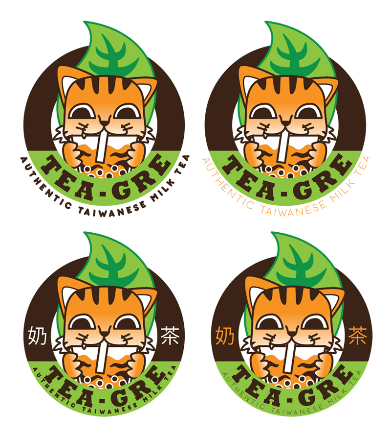
I placed the new text below Teagre. I also proposed to put chinese characters of milk and tea so that the spaces where Milk and Tea used to be will be occupied. They chose the last one with the thinner sub text below. However, they preferred to remove the chinese characters. Finally, here's the official logo of Teagre. I also rendered it in a milk tea cup so you can see how it looks like in the final product.

So what do you think about the final logo? Let's analyze it based on the four elements that I mentioned above. First, does it have the tea leaf? Yes. Second, is the font creative/quirky? Not really, but its readable. I think this is the weakest part of the design. I hope that they chose a more creative font style. Third, is there a secondary color? Yes, Orange. And fourth, does it have the cuteness factor? Yes! :3
I really hope I gave the client a logo that they desire. I did my best to cater every requests to come up with an effective design. Logo design is a very long process of research, design, and redesign. A lot of factor and elements should be considered and incorporated but its our job to lay them out and make sure it is a balanced and harmonious design. Personally, i have different preferences about the design but the client has the final word. At the end of the they, client satisfaction is the most important. :D


 Cedrick S. Zabala "CSZ97" is a multimedia artist based in the City of Zamboanga. He graduated with a Bachelor's degree in Information Technology major in Multimedia and Computer Animation. Currently he works at the City Government of Zamboanga under the Mayor's Office as a Public Information Officer, and as a part-time Instructor in Ateneo de Zamboanga University. He is currently taking his Master's Degree in Public Administration in Western Mindanao State University. He lives a life with a passion for the arts, culture, and travel. This blog contains his works and travel journals. Carpe effin' Diem!


Post a Comment